Loncat ke daftar isi utama

Bagaimana cara menyesuaikan Bagan Batang untuk membuat batang lebih lebar di Excel?

Penulis: Siluvia Terakhir Dimodifikasi: 2020-04-29

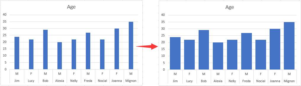
Artikel ini berbicara tentang menyesuaikan Bagan Batang untuk membuat semua batang lebih lebar di Excel seperti gambar di bawah ini.

Sesuaikan Bar Chart untuk membuat bar lebih lebar di Excel


Sesuaikan Bar Chart untuk membuat bar lebih lebar di Excel

Untuk membuat batang lebih lebar dalam Bagan Batang, lakukan hal berikut.

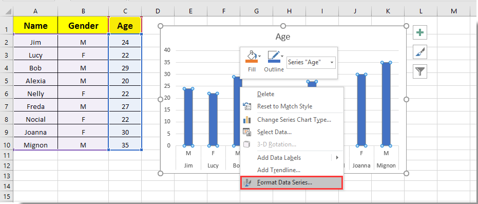
1. Klik di sembarang bar di Bar Chart dan klik kanan di atasnya, lalu pilih Format Seri Data dari menu klik kanan. Lihat tangkapan layar:

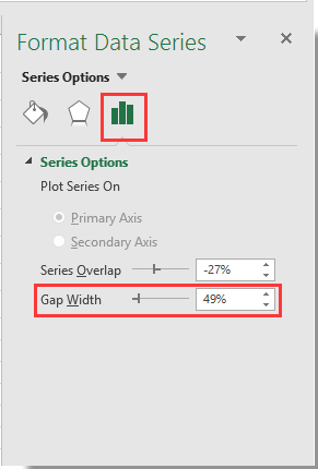
2. Dalam bermunculan Format Seri Data panel, pindahkan zoom bar dari Lebar Celah ke sisi kiri sampai lebar palang memenuhi kebutuhan Anda di bawah Opsi Seri bagian. Lihat tangkapan layar.

3. Tutup Format Seri Data pane

Kemudian Anda dapat melihat bar di Bar Chart yang ditentukan menjadi lebih lebar seperti gambar di bawah ini.

Alat Produktivitas Kantor Terbaik

馃 Kutools AI Ajudan: Merevolusi analisis data berdasarkan: Eksekusi Cerdas   |  Hasilkan Kode  |  Buat Rumus Khusus  |  Analisis Data dan Hasilkan Grafik  |  Aktifkan Fungsi Kutools...
Fitur Populer: Temukan, Sorot, atau Identifikasi Duplikat   |  Hapus Baris Kosong   |  Gabungkan Kolom atau Sel tanpa Kehilangan Data   |   Putaran tanpa Formula ...
Pencarian Super: VLookup Beberapa Kriteria    VLookup Nilai Berganda  |   VLookup di Beberapa Lembar   |   Pencarian Fuzzy ....
Daftar Drop-down Lanjutan: Buat Daftar Drop Down dengan Cepat   |  Daftar Drop Down yang Bergantung   |  Multi-pilih Drop Down List ....
Manajer Kolom: Tambahkan Jumlah Kolom Tertentu  |  Pindahkan Kolom  |  Alihkan Status Visibilitas Kolom Tersembunyi  |  Bandingkan Rentang & Kolom ...
Fitur Unggulan: Fokus Kisi   |  Tampilan Desain   |   Bar Formula Besar    Manajer Buku Kerja & Lembar   |  Perpustakaan Sumberdaya (Teks otomatis)   |  Pemetik tanggal   |  Gabungkan Lembar Kerja   |  Enkripsi/Dekripsi Sel    Kirim Email berdasarkan Daftar   |  Filter Super   |   Filter Khusus (filter tebal/miring/coret...) ...
15 Perangkat Teratas12 Teks Tools (Tambahkan Teks, Hapus Karakter, ...)   |   50 + Grafik jenis (Gantt Chart, ...)   |   40+ Praktis Rumus (Hitung usia berdasarkan ulang tahun, ...)   |   19 Insersi Tools (Masukkan Kode QR, Sisipkan Gambar dari Jalur, ...)   |   12 Konversi Tools (Angka ke Kata, Konversi Mata Uang, ...)   |   7 Gabungkan & Pisahkan Tools (Lanjutan Gabungkan Baris, Pisahkan Sel, ...)   |   ... dan banyak lagi

Tingkatkan Keterampilan Excel Anda dengan Kutools for Excel, dan Rasakan Efisiensi yang Belum Pernah Ada Sebelumnya. Kutools for Excel Menawarkan Lebih dari 300 Fitur Lanjutan untuk Meningkatkan Produktivitas dan Menghemat Waktu.  Klik Di Sini untuk Mendapatkan Fitur yang Paling Anda Butuhkan...

Deskripsi Produk


Tab Office Membawa antarmuka Tab ke Office, dan Membuat Pekerjaan Anda Jauh Lebih Mudah

  • Aktifkan pengeditan dan pembacaan tab di Word, Excel, PowerPoint, Publisher, Access, Visio, dan Project.
  • Buka dan buat banyak dokumen di tab baru di jendela yang sama, bukan di jendela baru.
  • Meningkatkan produktivitas Anda sebesar 50%, dan mengurangi ratusan klik mouse untuk Anda setiap hari!
Comments (9)
No ratings yet. Be the first to rate!
This comment was minimized by the moderator on the site
Thank you so much!!! so helpful.
This comment was minimized by the moderator on the site
Also been looking for a way to do this. Line chart over dates/times with bars when data (KGs) increased i.e. new delivery. Rather than change x axis type to text, I ended up having a filled border on bar. Need to select the same color fill as line and then select the border width to widen the bar. Can be done in VBA if chart is being produced with VBA?
This comment was minimized by the moderator on the site
Thanks. Works very well for me. At least I have gotten the bars wider. Easy to learn process. 
This comment was minimized by the moderator on the site
Your articles are life-savers!
This comment was minimized by the moderator on the site
Sorry... this doesn't work on a PC with Office365 2020.10. The control is there but even when set to zero percent for the gap width, the bars are scrawny little narrow bars which will accommodate no text overlay. Something not right.
This comment was minimized by the moderator on the site
Not in office365 but it might work for you, I have found a similar issue with "scrawny" bars on dates that adjusting overlay and gap width don't correct. To fix was as simple as reordering my data from oldest to newest and then changing axis type to "text axis" rather than "date axis" and then adjusting overlay and gap width. Give it a crack?
This comment was minimized by the moderator on the site
Well, that behaviour is brain-dead, but it worked for me too! Thanks.
This comment was minimized by the moderator on the site
Thanks Tom, that was a winner for me
This comment was minimized by the moderator on the site
same for my Office 365...
There are no comments posted here yet
Please leave your comments in English
Posting as Guest
Rate this post:
0   Characters
Suggested Locations